| |
|
Abstract
Does the modern commercial Graphical User Interface constrain the developer
of graphics applications into certain interaction styles? This paper looks
at the Microsoft Windows environment as an example, with particular reference
to the question of interaction modes, screen real-estate and visual appearance.
The concept of syntax channelling is introduced to help analyse the problem
of modality, and the question of button-down versus button-up dragging
is debated in the context of a range of commercial applications, and possible
consequences for upper limb disorder. A Windows application developed
by the author involving the implementation of a variety of innovative
interfacing techniques is presented.
Key Words: Graphical User Interface, graphics applications, Microsoft
Windows, syntax, interaction modes, dragging, upper limb disorder, 3D
graphics.
Background
The context of this discussion is the building of graphics applications
under Microsoft Windows 3.1 (referred to throughout this paper as just
Windows). Windows is used here as an example of a modern graphical user
interface (GUI), supplied to the software developer in the form of a developer's
kit, containing libraries of system calls and a set of development tools.
While most of the comments here are directly related to Windows, most
are generalisable to other GUIs, such as System 7 on the Mac/PowerMac.
It is not intended to point out specific advantages or shortcomings for
the graphics application developer in using Windows, but more to point
out how a substantial GUI like Windows can direct user interface development
in particular directions, and to encourage innovative thinking within
such a framework.
1. Syntax Channelling
1.1 The Language Model of Interaction
In order to understand how a particular GUI, or modern GUIs generally,
may encourage a limited range of interaction styles, it is useful to have
a model of the interaction between user and system. The language
model, described in Fundamentals of Interactive Computer Graphics
[Fole82], is useful. It suggests that each
interaction with the system can be divided into four levels:
(1) semantic the meaning or purpose of the task: this can be formalised
in terms of a change of state of the application domain
(2) syntactic the structure or sequence of actions to complete the task
(3) lexical the symbols used (e.g. words or icons) for each action
(4) device the input device used to supply lexical components
The system also requires an echoing and a feedback component: echoing
confirms the user input, while feedback indicates the results of completing
the request from the user. In the second edition the language model is
largely replaced with a range of concepts that include hierarchical task
analysis, and state diagrams [Fole90].
Attention in paid to Basic Interaction Tasks (BITs) and Composite Interaction
Tasks (CITs), and to whether the interaction involves a change of state
for the problem domain (application data) of the control domain (e.g.
changing a window's size and position). Also important is the concept
of mode, defined loosely as "a state or collection of states
in which just a subset of all possible user-interaction tasks can be performed."
As soon as one has to break down a CIT into a series of sequential BITs
one needs to consider syntax, that is the order of the inputs. Syntax
is discussed in relation to modes, for example a command Draw_line (perhaps
initiated by clicking on an icon) is followed by a series of inputs from
the user:
point point line_style line_thickness line_colour
The authors cite this as an example of prefix syntax (where the command
Draw_line is issued first and followed by parameters). As soon as the
command is issued the user has entered a mode where only certain interactions
are possible, and must come in a certain sequence. Some of the parameters
can be factored out; for example the line_style, line_thickness and line_colour
could all be set previously as current line attributes. It may
or may not be desirable to factor out all parameters however. To help
in this discussion I would like to introduce the term syntax channelling,
by which I mean the way the user is required to make inputs to complete
a task. By factoring out all parameters the user experiences the minimum
syntax channelling, but may have to spend more time setting up the control
domain. By increasing the syntax channelling the user may have to duplicate
inputs, and may be frustrated by being 'moded-in'. Let us consider this
in more detail.
1.2 Syntax Channelling
A complex task may require a number of user inputs. For example, to rotate
a 2D vector-based shape in a draw-type package it will be necessary to
select the shape, specify a centre for rotation, and then to specify an
angle to rotate about, including a direction (clockwise or anti-clockwise).
To draw a cuboid in a 3D modelling package it will be necessary to create
a rectangle (which in turn requires one to specify two diagonally opposite
corners), and then a length for the third dimension (two more points).
Once the task is commenced the user is channelled into a sequence of inputs,
though in some cases more than one input at a time can be supplied by
the user (e.g. horizontal movement of the mouse providing angle, vertical
providing radius). This syntactic channelling can be well or badly designed
from the point of view of the expectations of the user, and the design
may be partly dictated by the operating system.
How then, does a modern GUI like Windows dictate the design of syntax
channelling? The answer to this complex issue lies in the philosophy behind
all modern GUI programming: don't call us we'll call you. This
is known as call-back programming or the Hollywood Principle [Pree91].
1.3 Don't Call Us, We'll Call You
'Don't call us, we'll call you' is a simple way of saying that a system
is message-driven. The user is entitled to press, click, or in any way
interact with any part of the user interface, and the application should
process that message. If the message belongs to another application, or
part of the operating system, it should pass it on, and wait while another
application deals with it. If one's application absolutely cannot be interrupted,
then it is necessary to show some kind of busy symbol - in Windows the
hour-glass tracking symbol. This principle is at the core of modern software
development, and rightly so. Larry Tesler's crusade against modes that
shut you in [Tes81] has been mainly heeded in the design
of modern GUIs (Tesler's article on Smalltalk in Byte in 1981 shows
him wearing a T-shirt with DON'T MODE ME IN printed on it) . However,
it has had the side-effect of reducing the depth of syntax channelling.
This is not always intentional, and may require more conscious decision-making
than in traditional programmer-built interfaces. Modal dialogue boxes
(which require the user to close the box before continuing) are a visible
and obvious form of syntax channelling, but the user-manipulation of graphical
objects within the application domain results in less obvious syntax channelling,
as there is no accepted and simple way of making the mode obvious. A change
of tracking symbol is one method, a highlighting of the application client
area is another.
Let us take the example of rotating a 3D object under call-back programming,
assuming a particular sequence of inputs. Once the rotate command has
been initiated the user enters a (usually invisible) mode where the following
actions are required:
1. select object to rotate using mouse
2. select start and end-point in 3D for axis of rotation using mouse
3. input angle of rotation by moving mouse
In call-back programming this may require the processing of up to eight
mouse messages (four x and y coordinates each from a button-down / button-up
state change). The programmer's message handler must keep track of the
state of the rotate function, while passing on other messages to the system
message handler. The complexity of this is also influenced by the question
of button-up or button-down dragging.
1.4 Button-Down vs. Button-up Dragging
Dragging is a common part of user interaction in a GUI: the user clicks
at some point in the client area, and moves the mouse to a new location,
while holding the button down. This may be called button-down dragging,
and its alternative is button-up dragging. Some assume that dragging
must always be button down, as the state diagram in fig.1 shows,
taken from [Dix93]. In [Buxt85] a
similar diagram is shown, but with a footnote indicating that dragging
can also be button up. Dragging may by used to define a rectangular area
as a marquee selection, to indicate a region for object 'capture', to
enter an angle or other numerical value, or just to move something. In
a text editor text selections can be made by button-down dragging the
cursor through the required text. An alternative is to click once (with
the shift key down) and to click a second time at the end of the passage.
Although the difference between button-down and button-up dragging may
seem trivial, in fact a number of interfacing issues hang on it, including
syntax channelling. Fig.2 spells out the two approaches.
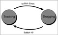 |
Figure
1. Dragging is thought of as button-down |
 |
Figure
2. Button down and button up dragging |
In [Preec94] the distinction is drawn between two types of gestural
syntax for menus: press-drag-release (this is the norm on the Macintosh)
or click-position-click (this is the norm for Windows, though the other
syntax can also be used). No mention is made of any studies regarding the
preferability of the two methods for menu selection, but I can offer a reason
for my own preference (the click-position-click syntax): if the cursor slips
off the menu with press-drag-release (a) the menu disappears, and (b) the
wrong item may have been selected. There are possibly other reasons for
preferring the second syntax, which we will look at shortly.
1.5 Dragging and Syntax Channelling
Button-down
dragging has an inevitable result on syntax channelling: it represents
a form of mode. This is because a button-down drag initiated in the client
area (to move an object for example) cannot affect anything outside the
client area. This is simply because all interaction objects in the non-client
regions are activated by a button-down interaction, not a button-up interaction
(in Windows this is true, and I suspect for the majority of other modern
GUIs). This syntax channelling is seen as an advantage by some as this
quote from [Buxt86] shows:
Think about how you interact with pop-up menus with a mouse. Normally
you push down the select button, indicate your choice by moving the mouse,
and then release the select button to confirm the choice. You are in a
state of muscular tension throughout the dialogue: a state that corresponds
exactly with the temporary state of the system. Because of the gesture
used, it is impossible to make an error in syntax, and you have a continual
active reminder that you are in an uninterruptable temporary state. Because
of the gesture used, there is none of the trauma normally associated with
being in a mode. That you are in a mode is ironic, since it is precisely
the designers of "modeless" systems that make heaviest use of
this technique. The lesson here is that it is not modes per se that cause
problems.
The author is making a parallel between muscular tension and a non-neutral
state of the system, i.e. a mode. There are other ways of indicating mode,
as will be discussed later, and it is not universally true that modes
should be un-interruptable - far from it. However there are interesting
conclusions to be drawn from this extract, as there are from another point
made in the same paper: that, having two hands, we can enter information
in parallel. This can be used to reduce the depth of syntax channelling.
In [Dix93a] it is argued that "mixing
keyboard and mouse is normally a bad habit", but in graphics (and
most other) applications it is so widespread that it cannot be dispensed
with (see section 4).
1.6 Fitt's Law
Fitt's law relates the time taken for a user to move a pointing device
from one place to another to the distance between them and the width of
the target area, and has been developed in computer interface studies
to look at the use of mice etc. in interaction tasks, by looking at target
areas, direction of travel, handedness, and even the effects of using
pie-shaped menus. In [MacK92] a Fitt's law study was applied
to moving a file icon to a trash can using three different dragging techniques:
1. DRAG_SELECT (corresponding to our button-down drag)
2. POINT_SELECT (corresponding to our button-up drag)
3. STROKE_THROUGH (button-down)
The author reported that the third method was faster up to certain distances,
when the button-up dragging became faster. The standard Macintosh technique
(button-down dragging) was always the slowest.
1.7 Repetitive
Strain Injury (Upper Limb Disorder)
Button-down dragging requires the forefinger to be in a state of tension
throughout the movement, and can be useful in indicating a mode. For occasional
use this is not a problem, but in graphics and DTP applications the time
actually spent in button-down dragging in a typical working day may be
considerable. There is anecdotal evidence of upper limb disorder resulting
from the use of mice, and I would suggest that button-down dragging may
increase this risk, as repeated actions are least harmful with minimum
muscle tension.
1.8 Case Study: Polyline and Move
How conscious a design decision by the software developer is button-up
vs. button-down positioning? I would suggest that the choice is fairly
arbitrary, and perhaps dictated by the context. For example if the context
is the movement of an icon or object, and the action is referred to as
dragging, then the choice is often button-down. If the context is rubber-banding
for the creation of a single line, circle or rectangle, then it may be
either. If it is the creation of a poly-line then it is universally button-up,
as you can't easily do it button-down.
The creation of a poly-line is an almost universal graphics application
requirement, especially if we add control handles to make it into a Bezier
curve. It is used in 3D for creating outlines and animation paths, in
2D vector-based packages to create PostScript curves, in paint packages
to create accurate selection outlines for cut and paste, and in morphing
packages to control the image distortion. Table 1. shows how the following
packages provide for poly-line and object move functions: 3D Studio, CorelDRAW!
WinImages:Morph, Painter, Photoshop, and Freehand. (3D Studio is a trademark
of Autodesk, CorelDRAW! is a trademark of Corel Corporation, WinImages:Morph
is a trademark of Black Belt Systems, Painter is a trademark of Fractal
Design, Photoshop is a trademark of Adobe Systems Inc, and Freehand is
a trademark of Aldus Corporation.)
|
3D
Studio
version 3 |
Corel-
DRAW! version 3.0 |
WinImage:
Morph version 2.04 |
Painter
version 2.0 |
Photoshop
version 2.5 |
Freehand
version 3.1 |
| O/S |
DOS |
Windows
3.1 |
Windows
3.1 |
Windows
3.1 |
Windows
3.1 |
System
7.1 |
| Polyline |
- |
- |
- |
- |
- |
- |
| (a)
points |
click-
position -
click |
click
-
position -
click |
click
-
position -
click |
click
-
position -
click |
click
-
position -
click |
click
-
position -
click |
| (b)
tracking symbol |
small
square |
cross |
Maltese
cross |
cross
with circle |
pen
tool icon |
cross |
(c)
echo of line/
curve |
rubber-band
line |
none
until press/
drag new point,
then curve |
none,
or drag for rubber-band line |
none,
or drag for rubber-band line |
none
until press/drag new point, then curve |
none,
or drag for rubber-band line or curve |
| (d)
Bezier curves |
drag
new
point |
drag
new
point |
use
different tool |
no
curves |
drag
new point |
n/a |
| (e)
close path |
click
on first
point |
click
on first point |
no
path closing |
select
new tool |
click
on first point |
click
on first point |
| (f)
exit |
must
close
path |
select
new
tool or
close path |
click
right mouse button |
select
new tool |
close
Paths window |
select
new tool or close path |
| (e)
modality issues |
cursor
constrained
to client area:
auto-scroll |
non-modal |
no
new tool can be selected until exit / abandon |
zoom
tool causes exit |
Paths
window must be active |
non-modal |
| (f)
abandon |
click
right mouse
button |
n/a
as not modal |
click
right mouse button |
n/a
as mainly not modal |
close
Paths window |
n/a
as not modal |
| Move
selection or object |
click-position-
click |
press-drag-
release |
press-drag-
release with right mouse button |
press-drag-
release |
press-drag-
release |
press-drag-
release |
Table 1: Polyline and Move functions for six different applications
Although five of these applications are for Windows, it is interesting to
note how varied the detailed implementation of the polyline is. This is
partly a function of how the polyline (as the basis for the Bezier curve)
is used in the package. Also of interest is the fact that the only DOS-based
package (3D Studio) makes the least use of button-down dragging, possibly
because it is not developed under a call-back operating system.
1.9 The Modern GUI and Syntax Channelling
Before leaving the issue of syntax channelling, let us consider how an operating
system like Windows dictates this aspect of user interface design. We have
shown that while it may be, in programming terms, slightly easier to implement
button-down dragging, there are plenty of examples of button-up dragging
in Windows applications. Once this is accepted there becomes no need to
limit the depth of syntax channelling, where required, or conversely to
reduce it to the minimum where required. The single example of a Macintosh
application in the Table 1. shows that the button-up style can as readily
be implemented in System 7 applications. I do not know, however, whether
the click-position-click menu selection method can be implemented on the
Mac, or whether the operating system forces the press-drag-release method.
(Windows allows both.)
A Photoshop plug-in shows an interesting example of an approach to syntax
channelling, or modality, that has possibly arisen out of the call-back
ethos. This plug-in filter simulates lens flare, and provides options, via
a modal dialogue box, for three types of lens and for a quantity of flare
between 10% and 300%, using a slider. The filter also requires the input
of a location on the user image for the flare centre, which is achieved
by using a scaled-down version of the user image, and an XORed cross-hair
which the user can move with the mouse by simply clicking at any position
over the image (see fig. 3).
 |
Figure
3. Modal Dialogue box for lens flare filter (dialogue box copyright
Adobe Systems Inc. 1991 - 1992) |
 |
Figure
4. Selection edges visible because of pixel brightening |
This is a
neat solution to the modality problem: all inputs are made within one
dialogue box, clearly labelled with a window title relating to its function.
However, it can in some circumstances be a harmful mode in Foley
et al's sense, as my own experience showed. I was working with some grey-scale
images with a resolution of 1960 x 736 pixels, and the scaled (sampled)
version of my image at about 190 x 70 pixels did not give me enough detail
to locate the exact position I wanted: over one of the car headlamps.
I was moded in! I had no access to the normal pan and zoom that
would let me locate a position accurately on a bitmap. My solution was
to use the floating selection of the car (which was being composited with
a background and represented about one-eighth of the total image area),
start the filter again, this time with enough detail showing for me to
locate the right spot. Unfortunately, the filter, now working up to the
edges of the selection, slightly brightened all the pixels in the selection,
though this was not visible on the screen of my computer due to poor gamma
correction. However it showed up in the final output, which was direct
to bromide using a laser setter (see fig. 4). Note that this image is
a portion of the complete image, and has had its brightness curves adjusted
to emphasises the selection edges. For a more detailed description of
the genesis and context of this image see [King95].
This last example demonstrates again the important principle never
mode the user in. Although syntax channelling is vital for the completion
of complex tasks without endless control-state preparation (or factoring
out), it does not predicate the moding out of the user. While the modal
dialogue box is a highly useful solution to many control-state interactions,
it may not be so useful in application-state interactions. In the lens
flare example, the user needs to specify a location, perhaps down to an
exact pixel, and simply needs access to the client area in the normal
way. Call-back programming makes programmers nervous of an 'invisible'
mode, where the user is required to make a specific locatory input. There
are many solutions to this, however, the simplest being a prompt and an
appropriate tracking symbol.
I would propose would a special and universal tracking symbol that would
alert the user to a modal phase of the system, i.e. that an input was
required, or that a sequence of inputs were required. This would incorporate
an exclamation mark (to indicate a state of 'tension'), and perhaps a
numerical indicator for the depth of channelling. If, going back to our
3D rotate example, 4 locations are required, the tracking symbol could
contain the pling, and the number from 4 down to 1, indicating how many
inputs were still required (see fig. 5). It may be that the number alone
is sufficient, and it is worth remembering that in many systems users
rapidly learn the depth of the syntax channelling if the inputs logically
relate to the task in hand.
 |
Figure
5. Tracking symbol indicates modedness and depth of syntax
channelling |
2. Visual Issues in the Interface
2.1 Real-Estate
Another major design issue affected by modern GUIs relates to screen 'real-estate'.
For art and design packages the user often needs the maximum screen area
possible given over to the client area. Windows, perhaps because of its
intended business user-base, takes a little more real-estate than System
7, an example being that a primary application window is required to have
both a title bar and a menu bar. In System 7 there is only one menu bar,
the current application displaying its menus there, with little other
clue as to what software is currently running. One can argue that Windows
is less confusing as the title bar spells out the application (and usually
the currently open document), while the menu bar displays only the menu
titles for that application. However, real-estate is lost.
It is worth mentioning that for some user-interface researchers the problem
of real-estate is in having too much! In [Cowa91]
the authors discuss the use of high-resolution 21" monitors, and
the difficulty of making active windows stand out from the rest. However,
I am discussing the use of cheap to mid-range systems where screens are
not so large, and typical resolutions are 800 x 600 pixels. Windows does
in fact cater for differences in resolution by having interfacing elements
such as dialogue boxes scalable, according to the point size of the system
font. However, the system font is set by the video card drivers, and is
not easily changed. Many graphics applications which use multiple child
windows (or palettes) for provision of tools, fonts, colour, styles and
so on, have abandoned the system-provided windows and dialogue boxes in
favour of their own. This is wasteful of the developer's effort, and leads
to a range of styles: for example the close box, which in Windows normally
requires a double-click, takes a single click in some packages. Photoshop,
CorelDRAW! and Painter all use their own specialised palettes to overcome
the problem of real-estate, a common feature being the much narrower title
bar (required to move the palette) than Windows allows for.
2.2 Aesthetics
The 'look' of Windows interfaces is sometimes criticised by Mac users
as cluttered, clunky or crude, and the graphics application developer
may agree. However, many Mac graphics applications now have such sophisticated
graphics as part of the interface as to make for a complete aesthetic
- which may be completely at odds with the user's aesthetic. Quantel
Paintbox users are famous for being against the introduction of icons
into the user interface of their system on the grounds that they are visually
distracting. All Quantel commands are entered via a text-only menu system.
Even so, the system uses a distinctive pink and grey colour scheme. I
would argue for the utmost visual neutrality in the interface to graphics
systems, and, as a design precept, this is not compromised more in either
the Mac or Windows. Let us use greys as a colour scheme, and keep icons,
where used, to the visual minimum. Fig. 6 shows the interface to Fractal
Design's Painter (version 2.0), which is otherwise an excellent package,
but is visually very rich. I have shown all the interfacing windows, though
in practice an artist would have only a few visible at any one time, and
would often work 'full screen', using 100% of the screen area, with no
menus or title bars visible at all. Of the windows shown in fig.6 the
Brush Looks, Brush, Frisket and Fill palettes are the most complex, and
use multi-coloured images. The artist can 'bracket out' the imagery and
style of these palettes, but this takes effort.
 |
Figure
6. Dialogue boxes (non-modal palettes) in Fractal Design's
Painter |
3. Hot Buttons
Both Windows and System 7 give the user keyboard shortcuts to speed up
interaction with the application. Some consider it the mark of the professional
to rarely use the menus at all, but this is probably an exaggerated view.
However, many do use a limited set of keyboard shortcuts, those for save,
copy and paste probably being the commonest. In Windows there is provision
for every menu command to have a keyboard shortcut: the user is required
to hold the <Alt> key down, then a letter belonging to the menu
name (e.g. F for the File menu, E for the Edit menu), and finally a letter
belonging to the menu item (preferably the first). This is indicated in
Windows menus by an underlining of the letter, the programmer implements
it by preceding the letter with an ampersand. With System 7 keyboard shortcuts
are provided by holding down the apple key and one other letter (this
is faster, but limits the range of shortcuts).
I have developed an innovative system whereby the last 8 menu commands
appear on hot buttons, as two letter identifiers, corresponding to the
menu letter and the menu item letter. I have placed these, unusually,
on the menu bar in order to save on screen real-estate. This system is
probably of much more use in graphics packages where one is in an exploratory
mode: for example one might adjust a light position and colour in 3D graphics,
re-render, and adjust the light again. The hot-buttons are well suited
to this iterative and exploratory method of working, but do not replace
the macro concept where a pre-determined task needs to be repeated. Copies
of the hot buttons also appear on each modal dialogue box, allowing rapid
movement around the system (pressing a hot button automatically closes
dialogue boxes to any depth). Fig. 7. shows a screen shot of a software
package called of RaySculpt (described below) with dialogue boxes and
hot buttons. Note that the command RG has been issued repeatedly - this
is the rendering command, short for Render Go - as the user is making
changes to parameters to a marbling texture routine.
4. RaySculpt - a Test-Bed for Interfacing Issues
I have been implementing graphics applications for about ten years, including
paint, draw, and 3D packages, as well as file translation and colour printing
utilities, some of which are still in use by my students today, see [King88] and [King89].
RaySculpt derives from a ray tracer written by my colleague Richard Wright,
and a modeller based on spheres, originally known as 'Sculptor' [King91]. Raysculpt combines modeller
and ray tracer in a single Windows package, and presents a wide range
of interfacing problems, as well as one of my principle tools of artistic
expression. As well as incorporating some of the design principles discussed
earlier (button-up dragging, syntax depth reporting, clear and escapable
'moding', hot-buttons, and minimal visual impact) there remain some uniquely
3D related interfacing issues. I will discuss just one: the specification
of a 3D location with a 2D device (the mouse). In Autodesk's 3D Studio
(a tour de force in many ways, and champion of the button-up approach)
one has the concept of a current viewport representing plan, elevation,
left and right side views. Only two of the three 3D coordinates can be
specified at any one time, depending on the current viewport. For example,
if you wish to move an object along all three axes, you have to do two
move operations, in two different viewports. I have always found this
a frustration, as I developed Sculptor over ten years ago with a simple
method for switching between viewports, allowing for rapid positioning
in three dimensions. The technique also relies on a third-angle projection,
with coordinated positioning in each view, and the use of keys at the
keyboard to allow parallel input of information. The syntax channelling
is thus reduced in depth but broadened, making for a less modal
interaction.
Fig. 7 shows the RaySculpt interface in an intermediate state of development,
but incorporating many of the interfacing concepts outlined in this paper.
Dialogue boxes are all modal, while client-area modality is indicated
by highlighting around the area. Colour is only used in the interface
for lights, in the material editor, and for low-resolution previews of
the rendered file - otherwise all elements are drawn in greys. Fig. 8
shows example output from the system output at high resolution.
 |
Figure 7 RaySculpt
Screen Layout |
 |
Figure 8 Example
Imagery from RaySculpt |
Conclusions
It seems that a modern commercial GUI like Windows makes few actual constraints
on the design of the user interface, though the call-back programming style
may imply certain solutions. By introducing the concept of syntax channelling
it becomes easier to analyse interactions and make conscious design decisions
in connection with the problems of modedness. In particular, client-area
interactions need clear indications of syntax channelling. It may be unwise
to rely on button-down dragging to do this as there could possibly be a
link with upper limb disorders. Research needs to be done to see whether
there is any connection with button-down dragging and upper limb disorder
related to the use of mice, or whether other factors are more important.
Fitt's law studies for button-down vs. button-up timings would also be useful.
Implementers of graphics packages could be encouraged to avoid a strong
'aesthetic' to the interface, by using simple icons and colour schemes.
To conclude: modern GUIs may suggest certain interfacing solutions, but
in practice the graphics application developer must still solve many of
the specialised problems in innovative ways. This requires both art and
science.
References
[Buxt85] Buxton, W., Hill, R.
Rowley, "Issues and Techniques in Touch-Sensitive Tablet Input"
in Computer Graphics (SIGGRAPH conference proceedings), The Association
for Computing Machinery, New York, 1985.
[Buxt86] Buxton, W. "There's
More to Interaction than Meets the Eye: Some Issues in Manual Input"
in Baecker, R. and Buxton, W. (Eds.) Readings in Human-Computer Interaction,
Morgan Kaufmann, Los Altos 1987.
[Cowa91] Cowan, W. and Loop, S.
"Perceiving Window Geometry: An Experimental Study" in Graphics
Interface (Proceedings of the Canadian Human-Computer Communications
Society), The Canadian Information Processing Society, Toronto 1991, pp.
192 - 198.
[Dix93] Dix, A., Finlay, J. Abowd,
G. Beale, R. "Human Computer Interaction", Prentice Hall, 1993
[Dix93a] Dix, A., Finlay, J. Abowd,
G. Beale, R. "Human Computer Interaction", Prentice Hall, 1993
p. 212.
[Fole82] Foley, J., Van Dam, A.
"Fundamentals of Interactive Computer Graphics", Addison-Wesley,
1982.
[Fole90] Foley, J., Van Dam, A.,
Feiner, S. Hughes, J. "Computer Graphics - Principles and Practice"
(2nd Edition), Addison-Wesley, 1990.
[King88] King, M.R., "Development
of an Integrated Computer Art System", in N. Magnenat-Thalmann and
D. Magnenat-Thalmann, eds., New Trends in Computer Graphics, Proceeding
of the CG International 1988 (Berlin: Springer-Verlag, 1988) pp. 643
- 652.
[King89] King, M.R., "Towards
an Integrated Computer Art System", in R. J. Lansdown and R. A. Earnshaw,
eds., Computer in Art, Design and Animation, Proceedings of the 1986
conference at the Royal College of Art (London: Springer-Verlag, 1989),
pp 41 - 55.
[King91] King, M.R., "Sculptor:
A Three-Dimensional Computer Sculpting System", in Leonardo,
24, No. 4 (383-387) 1991.
[King95] King, M.R., "Programmed
Graphics in Computer Art and Animation", to be published in Leonardo,
early 1995.
[MacK92] MacKenzie, S. "Movement
Time Prediction in Human-Computer Interfaces", in Graphics Interface
(Proceedings of the Canadian Human-Computer Communications Society), The
Canadian Information Processing Society, Toronto 1992, pp. 140 - 150.
[Pree91] Pree, W., Pomberger,
G., Sikora, H. "Construction Techniques of Graphic Direct-Manipulation
User Interfaces", in Post, F. and Barth, W. (Eds.) Eurographics,
North-Holland, Amsterdam, London, New York, Tokyo, 1991, pp. 59 - 71
[Preec94] Preece, J. Rogers, Y.
Sharp, H., Benyon, D., Holland, S., Corey, T. "Human Computer Interaction",
Addison-Wesley 1994.
[Tes81] Tesler, L. "The Smalltalk
Environment" Byte, Vol. 6 No. 8, August 1981, p.90.
|
|